PUPSTUDIO
Brand Concept & Positioning
Visual Identity & Logo Design
Graphic Language
Brand Design System
Website Design
Creative Direction
Brand Renewal
Design
DKstudio
Client
PUPSTUDIO NYC
Release date:
July 2026
Challenge
친근함을 유지하며, 프리미엄으로 나아가기
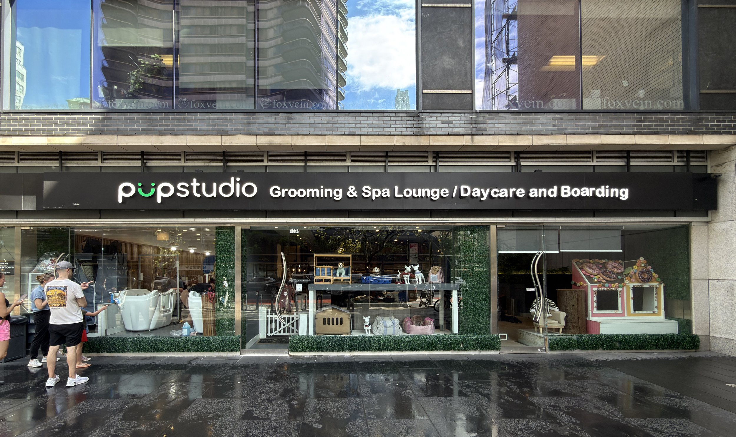
PUPSTUDIO는 편안하게 다가갈 수 있는 친근함과 높은 수준의 케어에 어울리는 품격을 함께 갖춘 브랜드로 거듭나고자 했습니다. 기존 로고의 밝고 친숙한 이미지를 바탕으로, 서비스의 전문성과 세심함을 더욱 설득력 있게 전달할 새로운 시각적 정체성이 필요했습니다. 핵심 과제는 고객과의 정서적 거리를 유지하면서 브랜드의 프리미엄 이미지를 강화하는 것이었습니다.
Elevating the brand while preserving its warmth
PUPSTUDIO sought to become a brand that combined an approachable personality with the refinement befitting its high standard of care. Building on the warmth and familiarity of its existing logo, the brand needed a new visual identity to better communicate its expertise and attention to detail. The challenge was to strengthen its premium positioning while preserving its connection with customers.
Solution
친숙한 반려견에, 세련된 품격을 담다
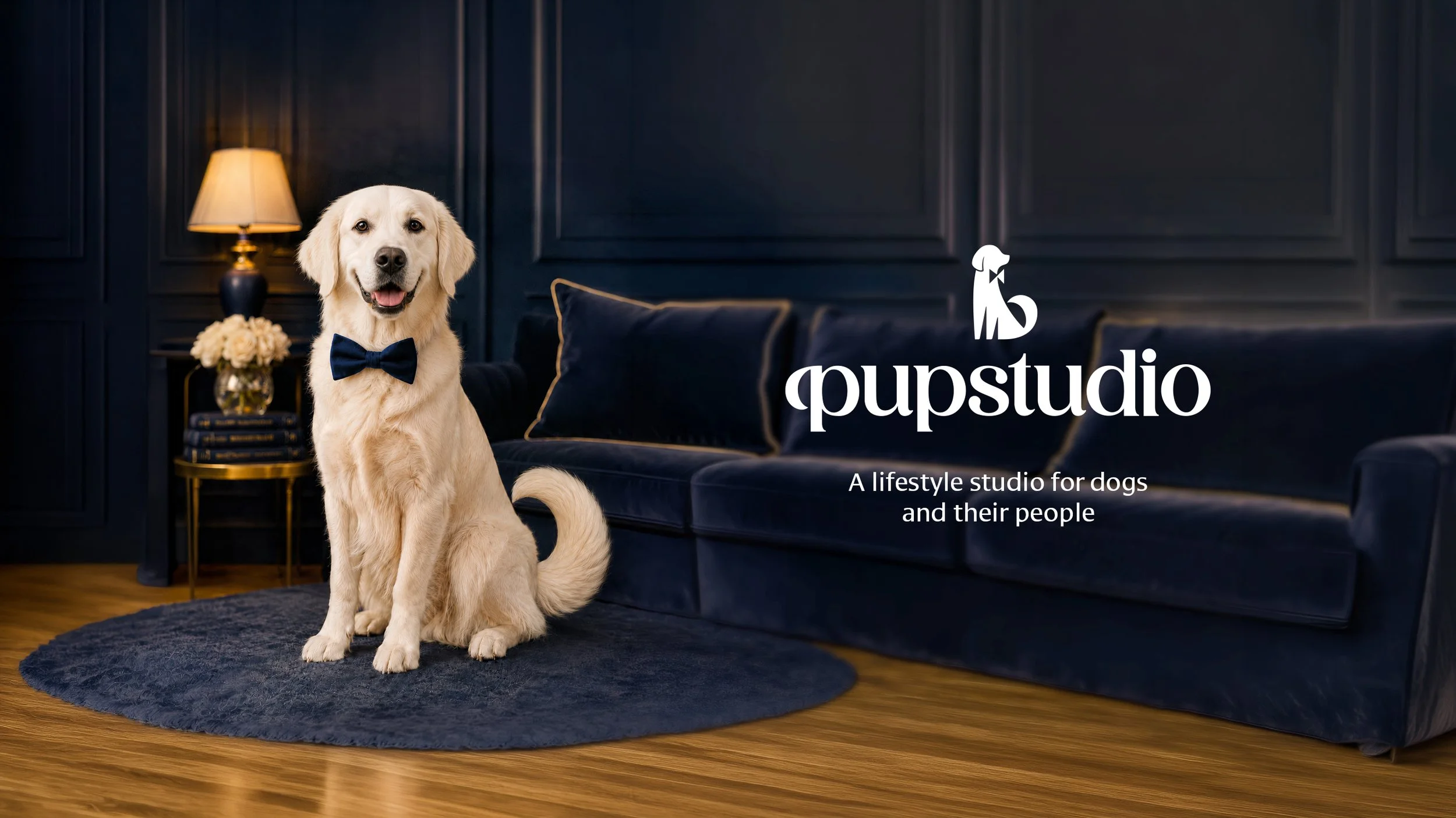
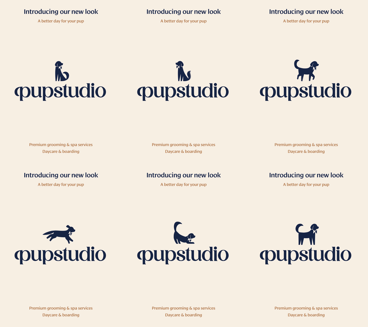
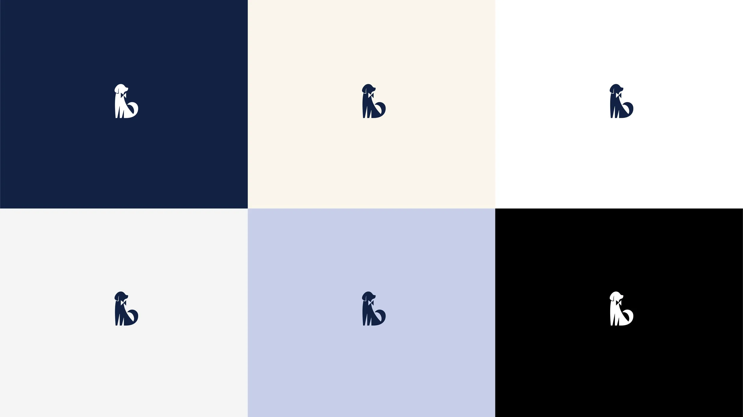
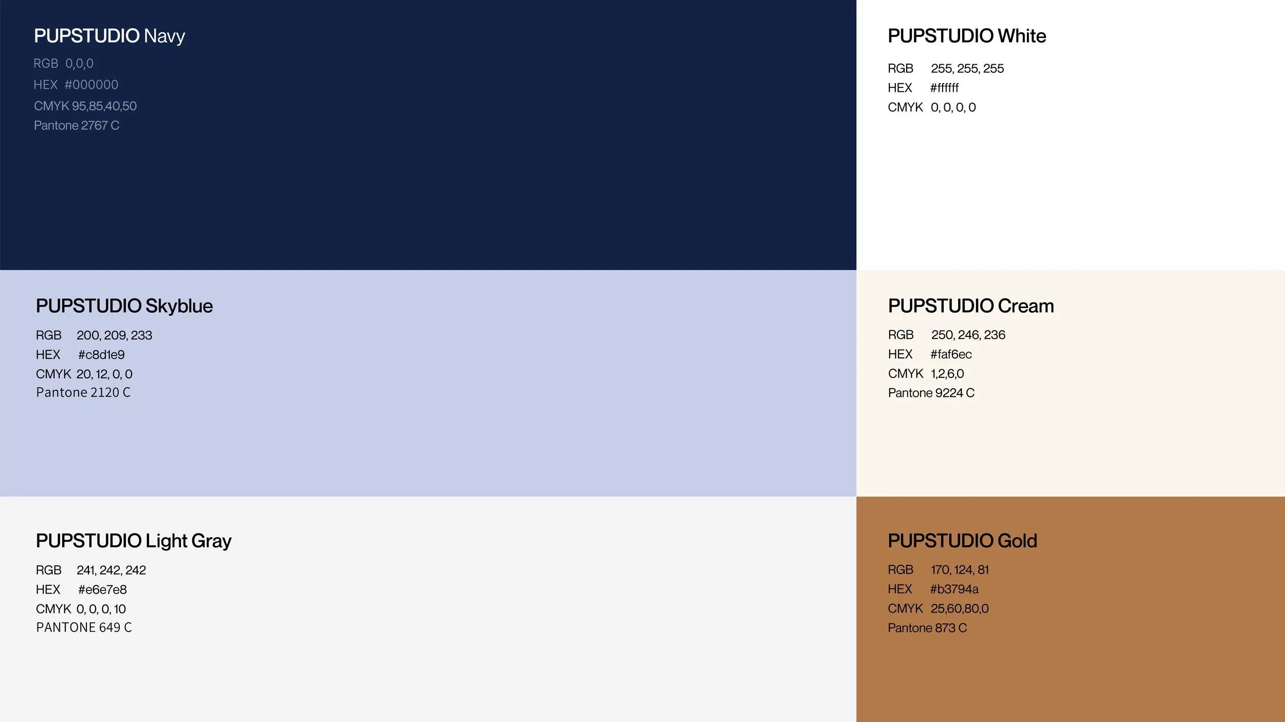
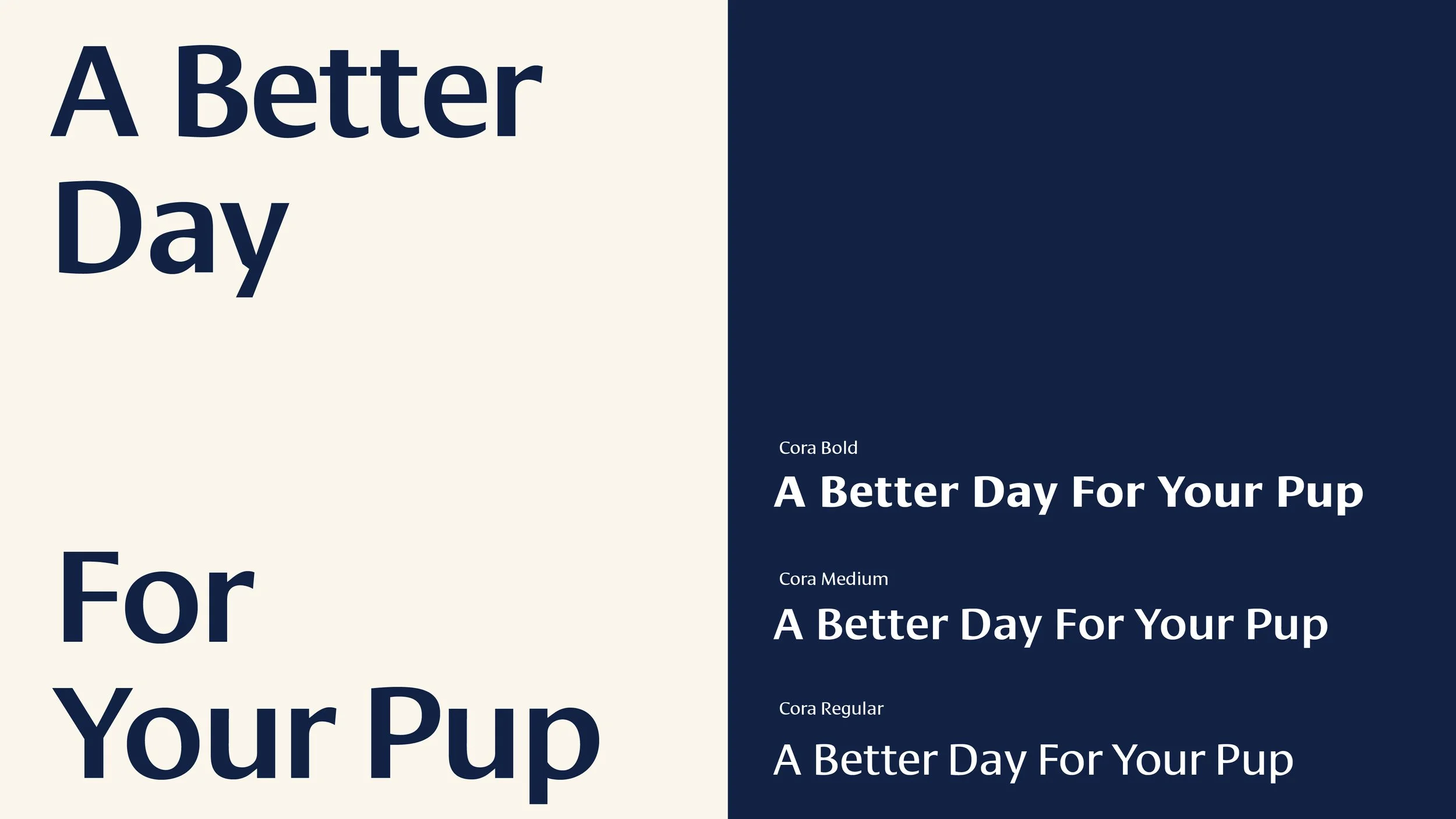
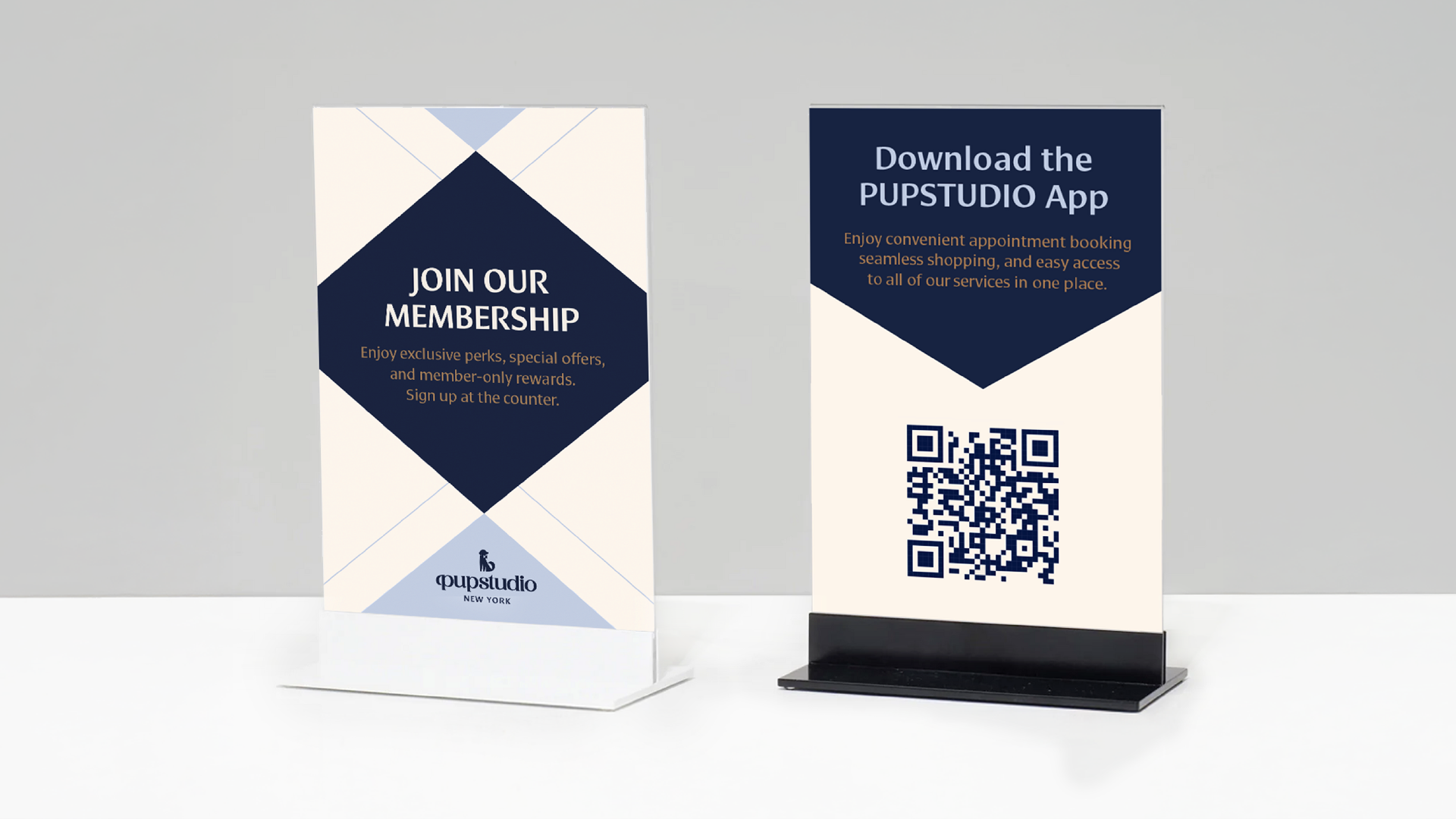
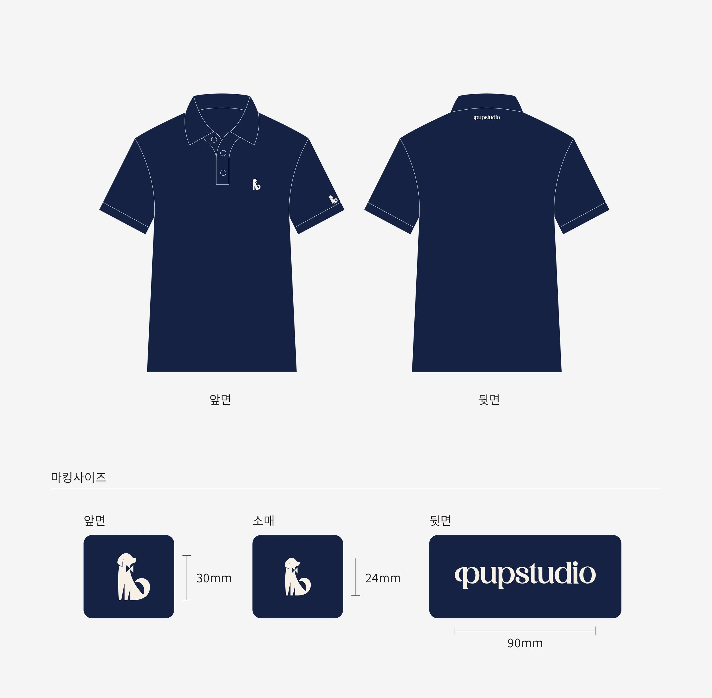
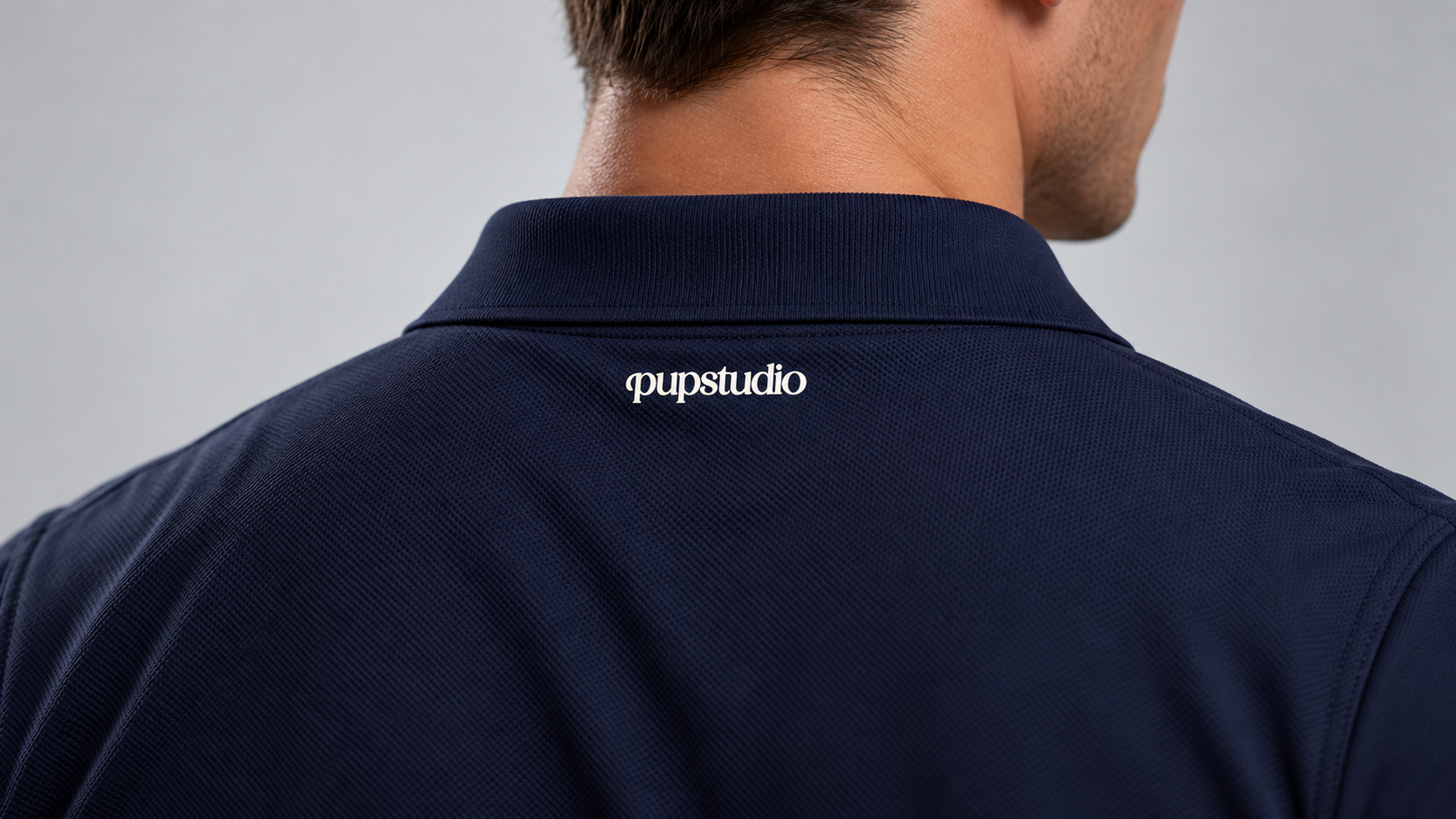
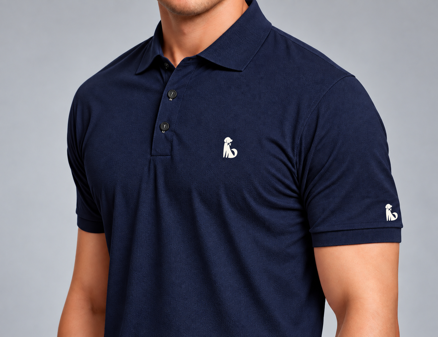
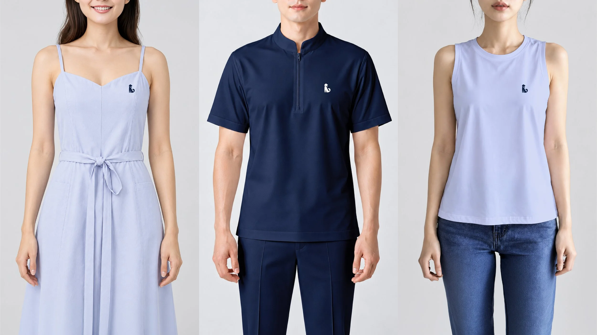
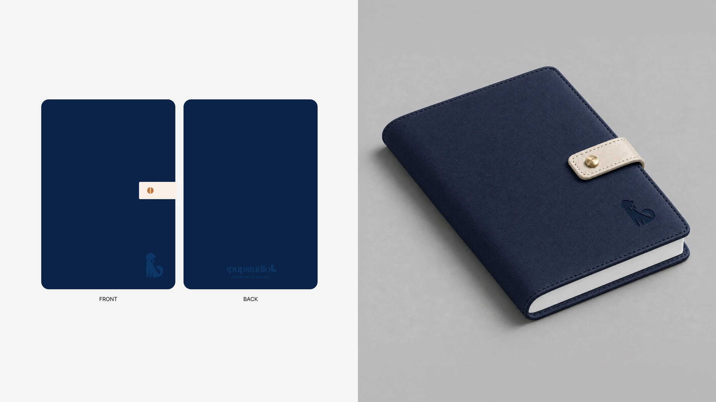
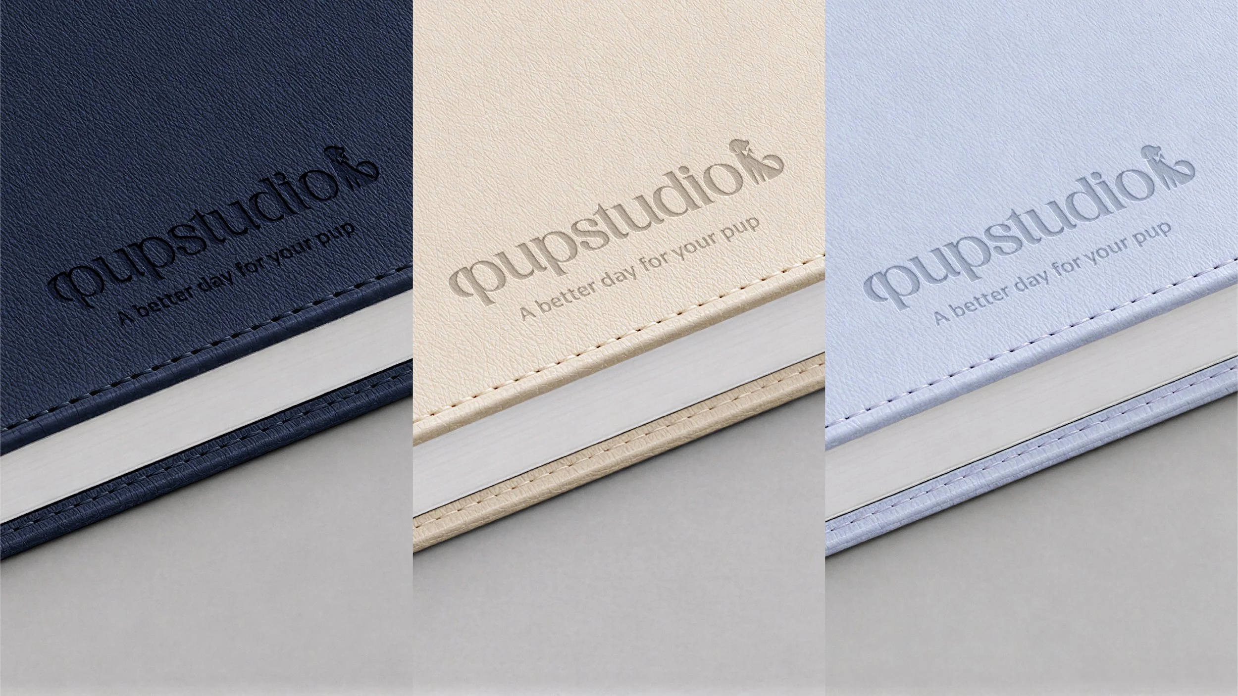
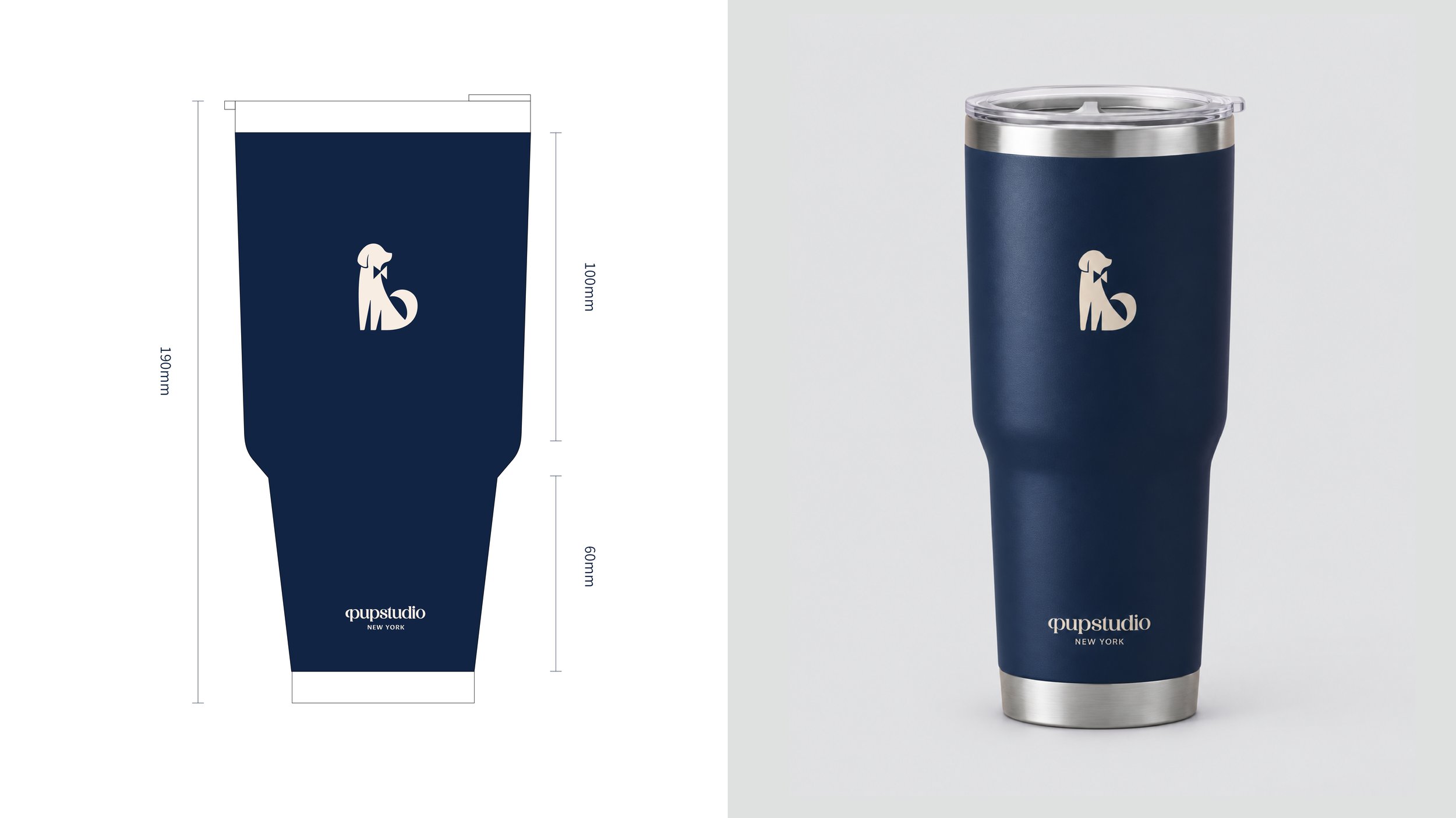
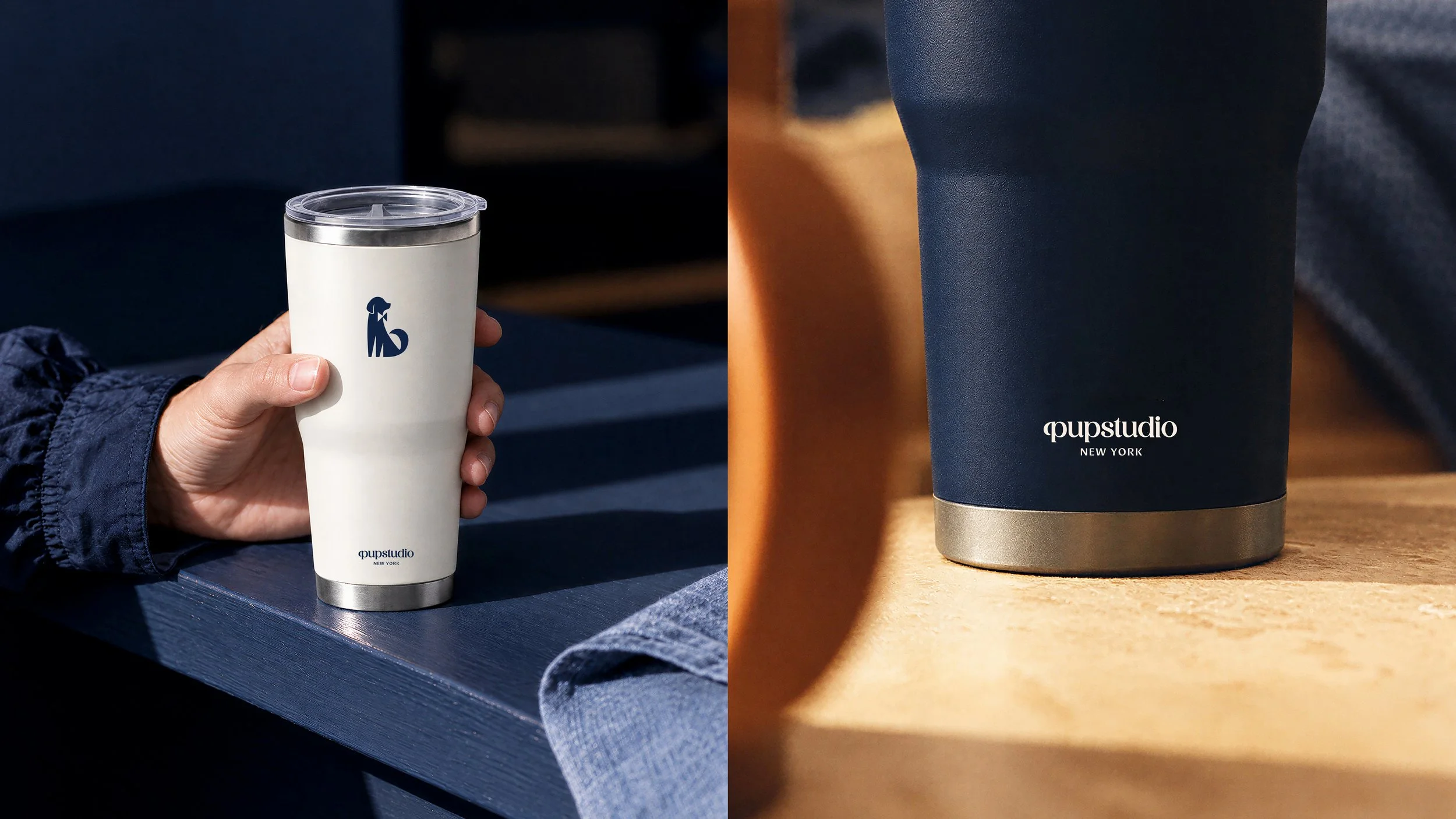
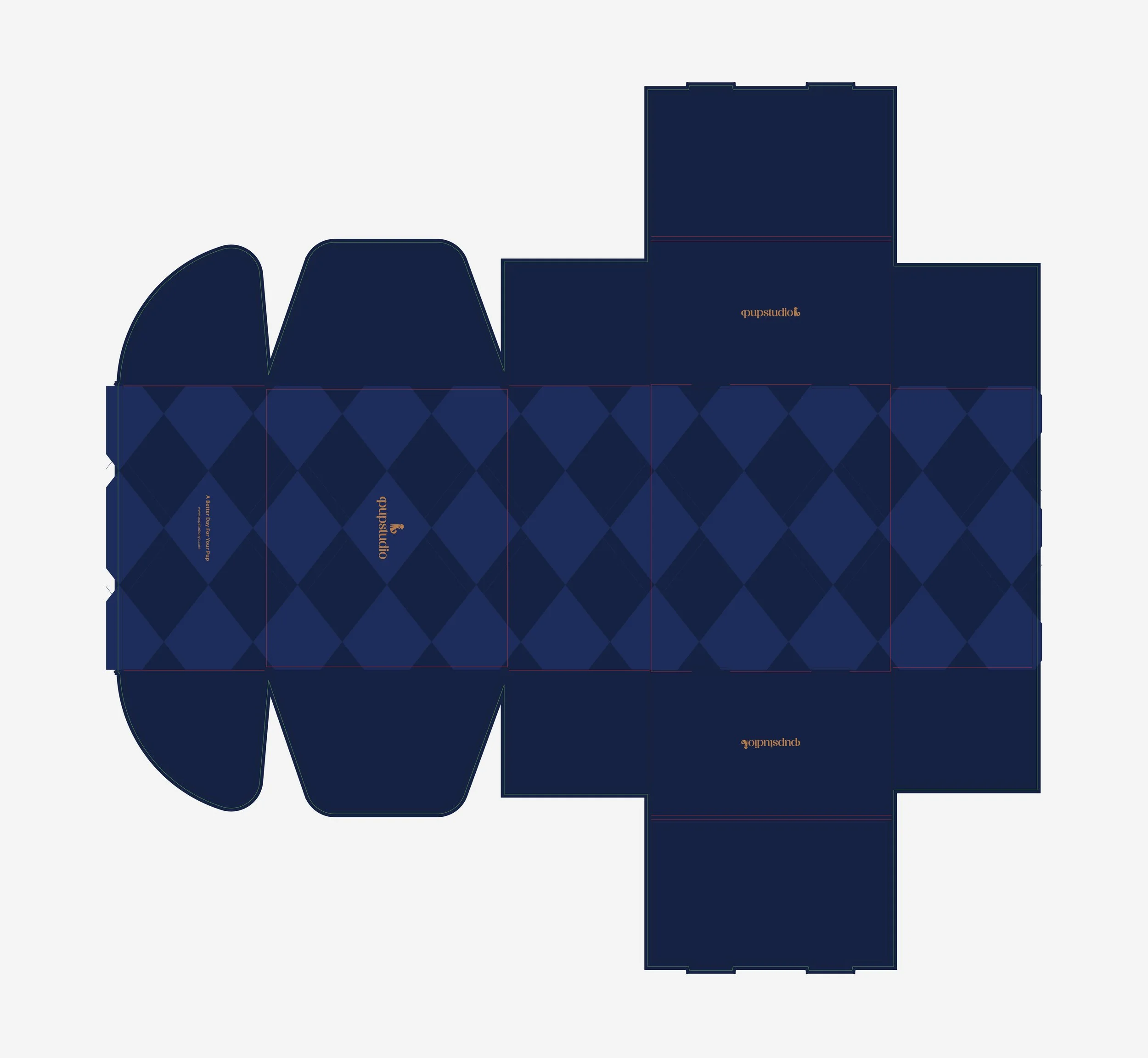
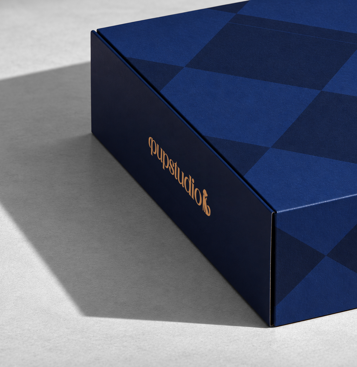
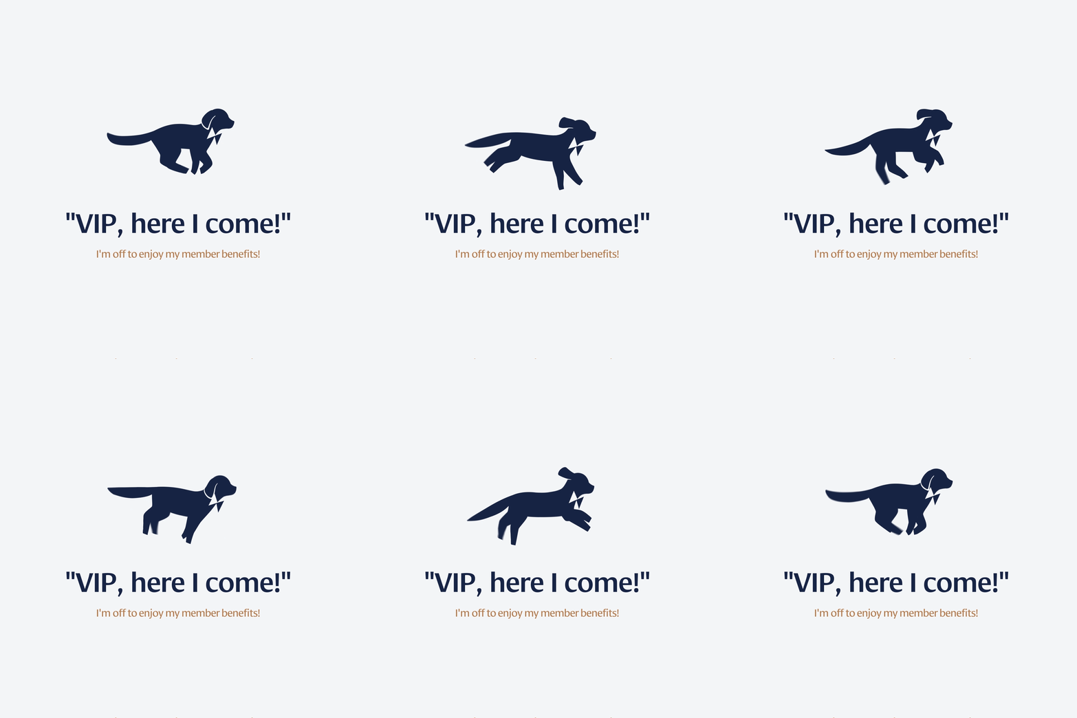
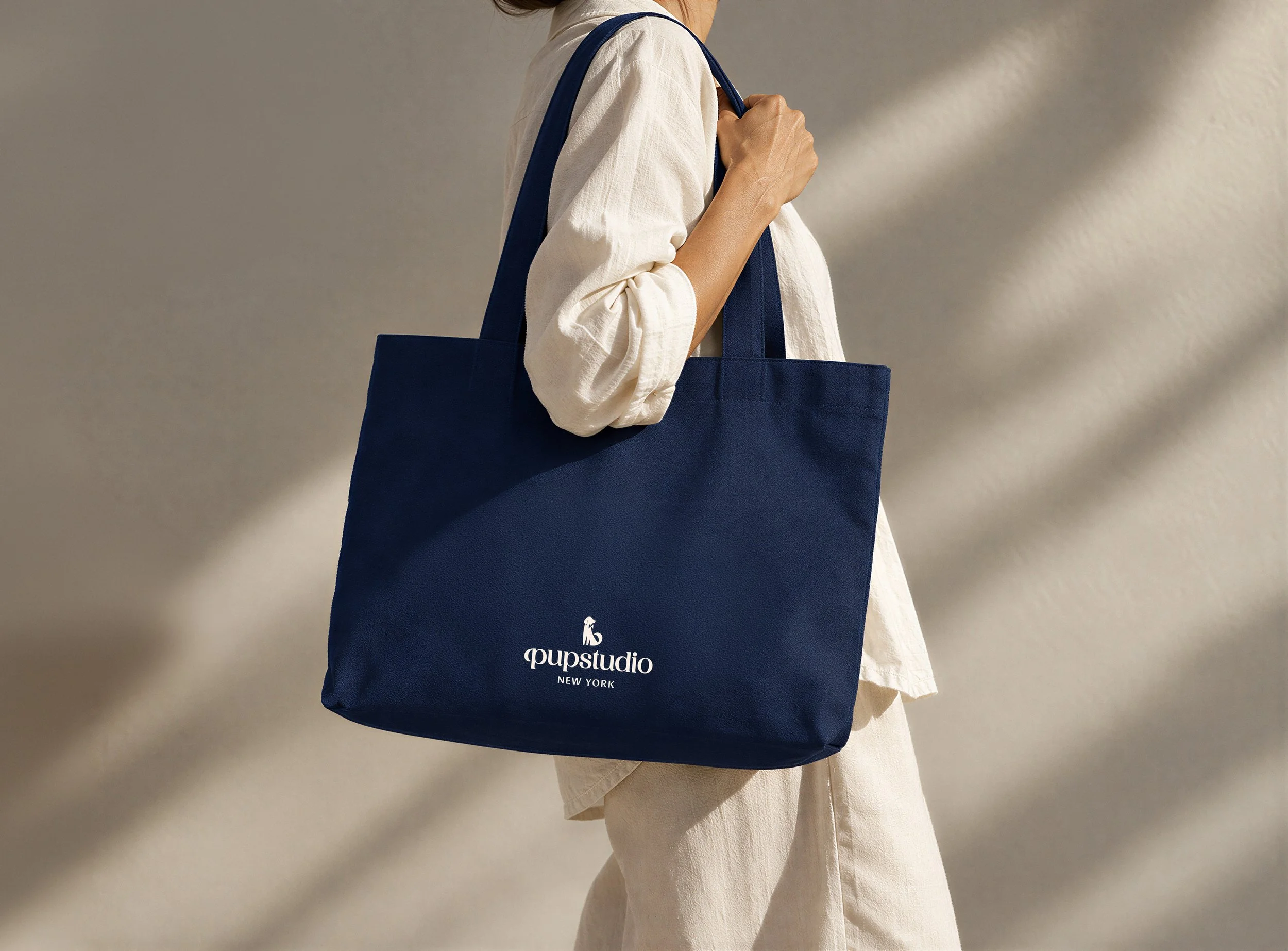
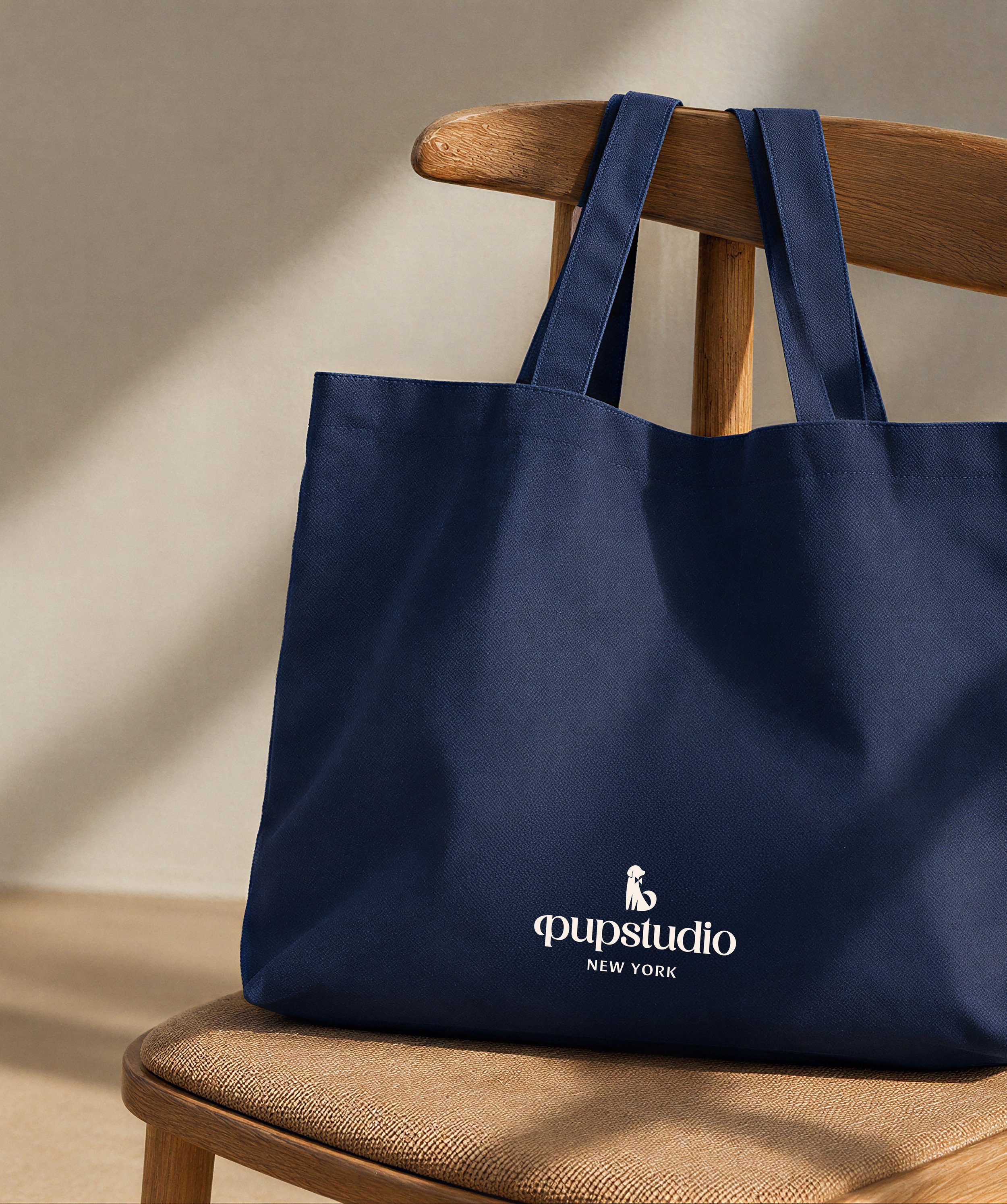
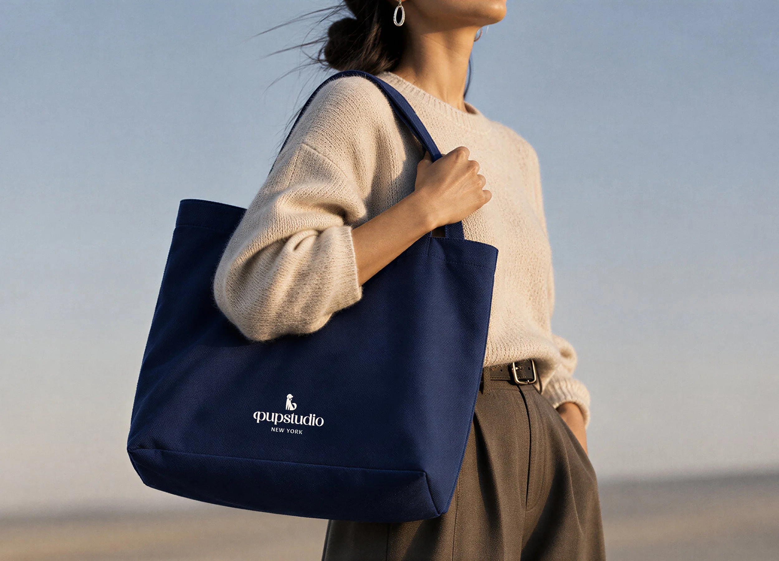
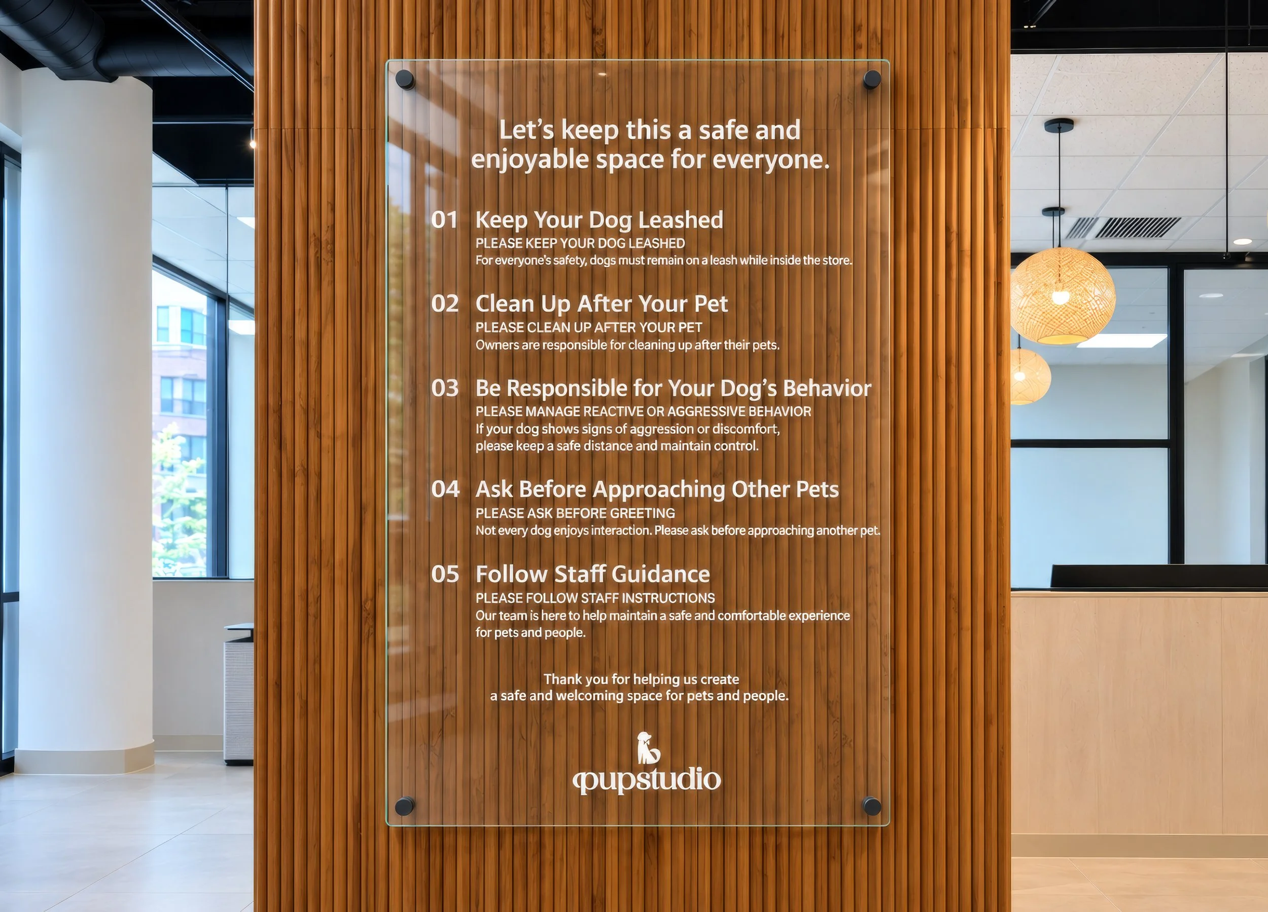
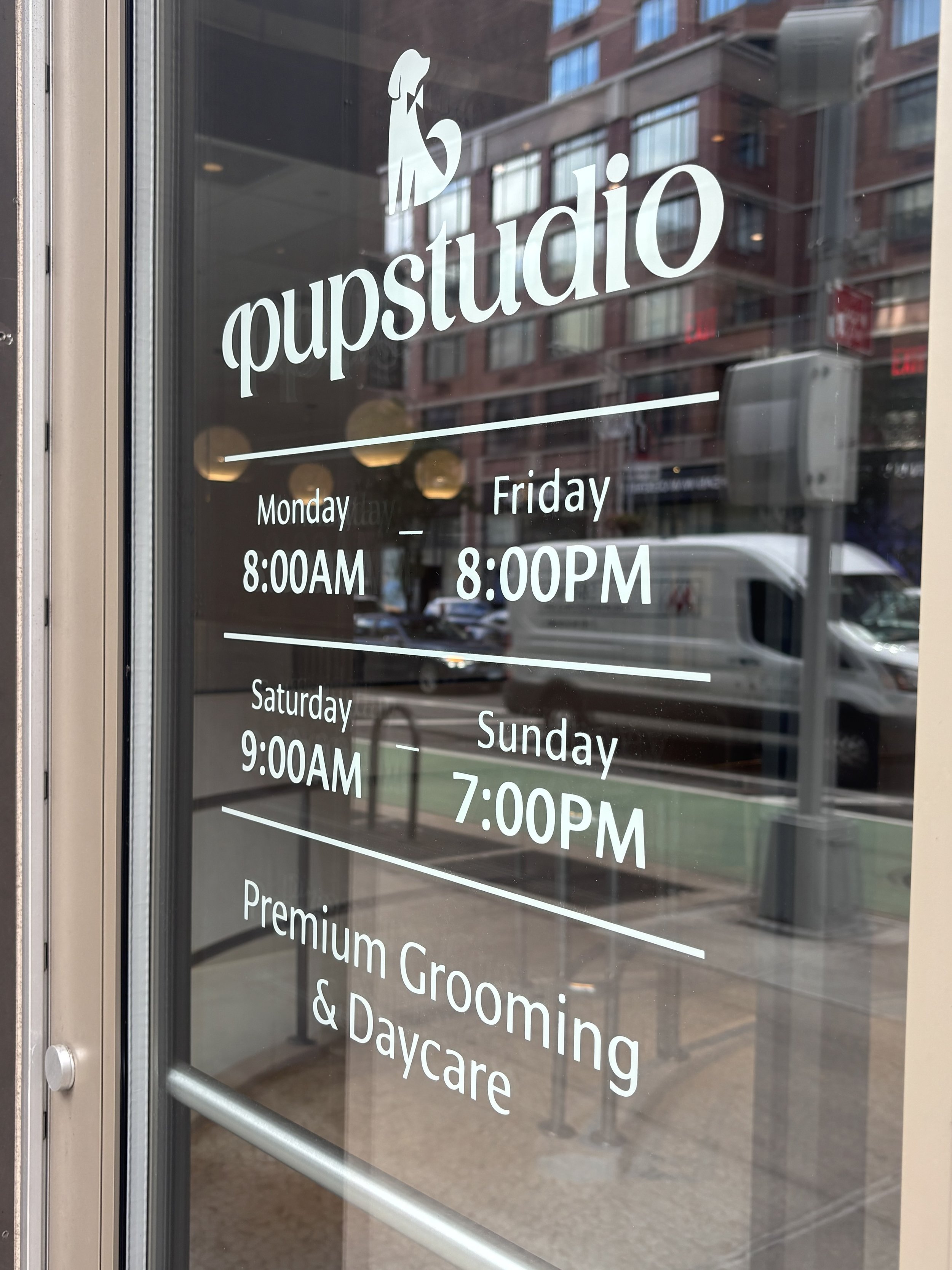
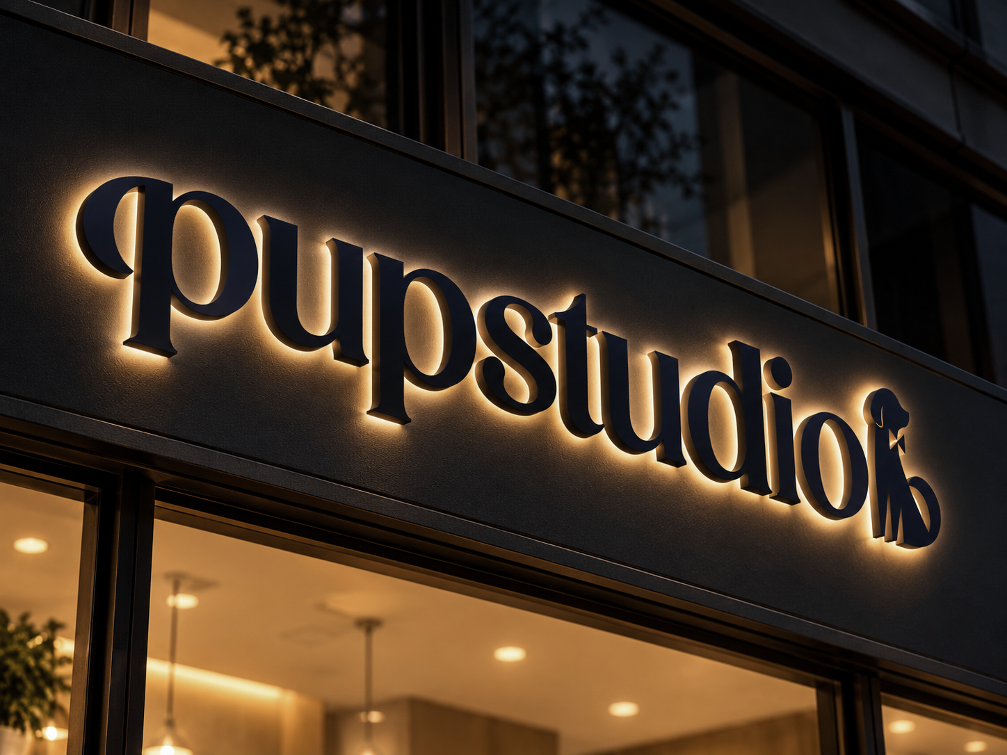
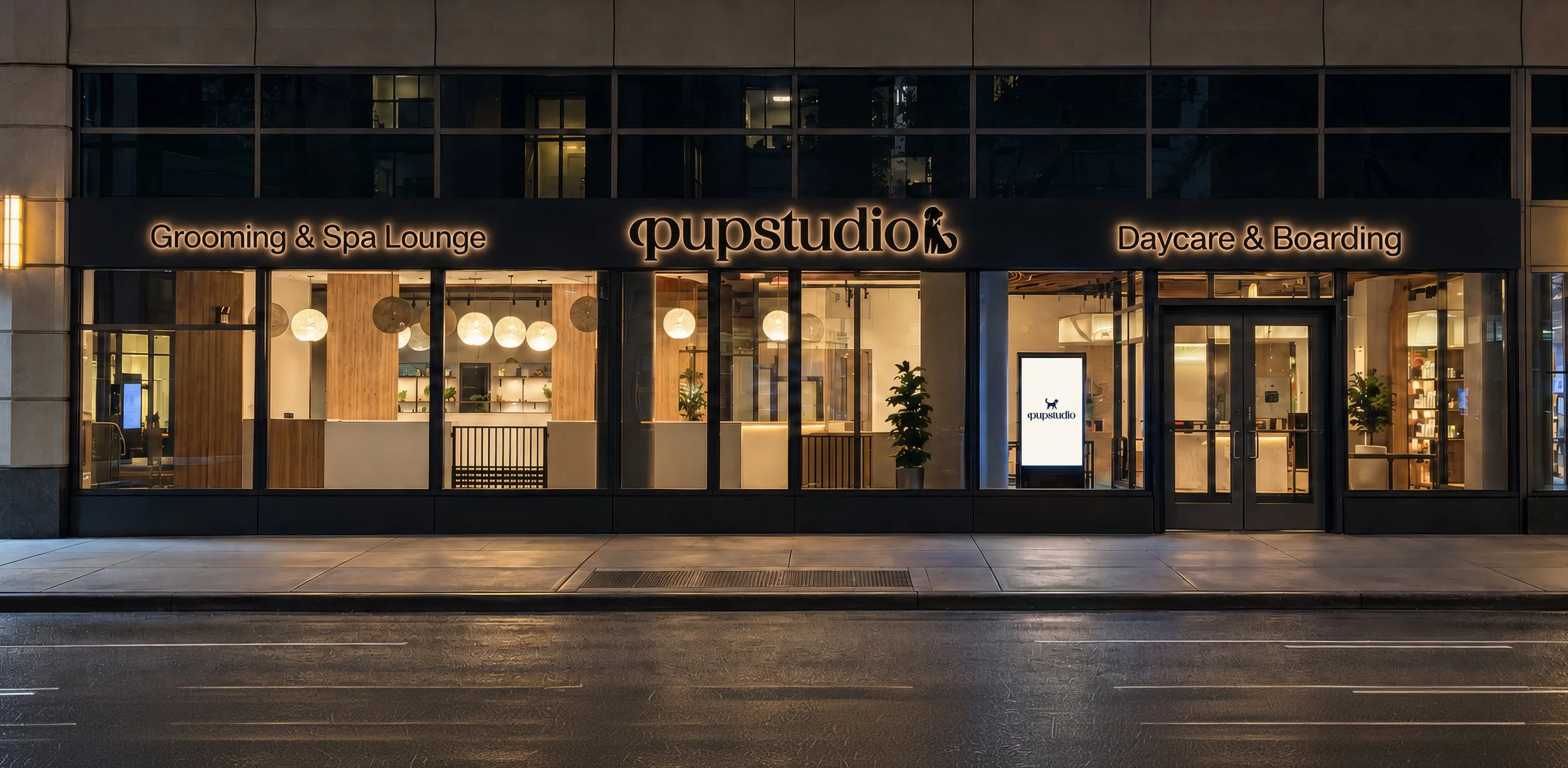
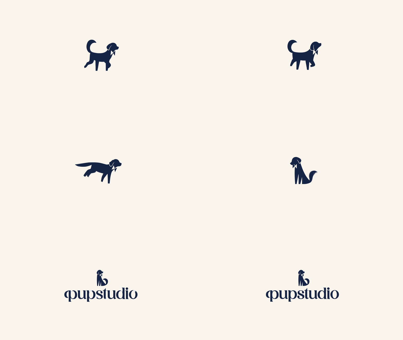
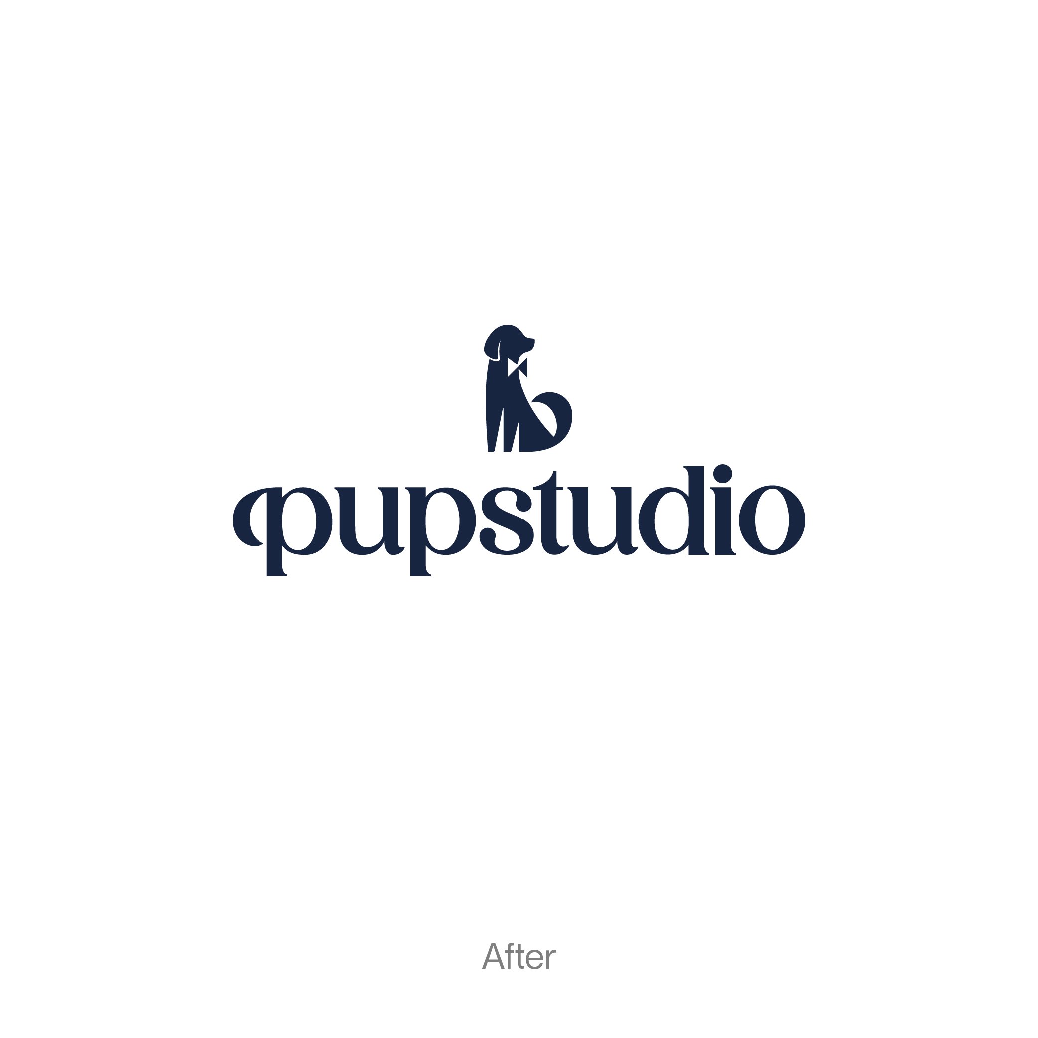
우리는 보타이를 한 반려견 심볼과 우아한 세리프 워드마크를 결합해 PuPstudio의 새로운 아이덴티티를 구축했습니다. 친숙한 반려견의 모습에 보타이의 단정함을 더해 따뜻함과 품격이 공존하도록 했으며, 소문자 워드마크와 딥 네이비 컬러로 부드러움과 차분함의 균형을 잡았습니다.
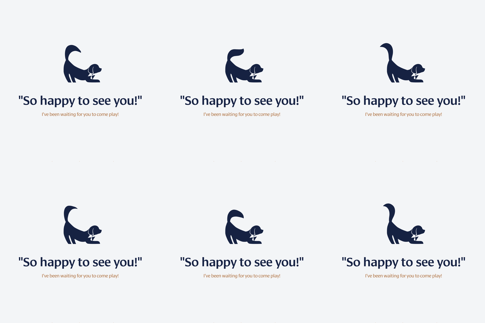
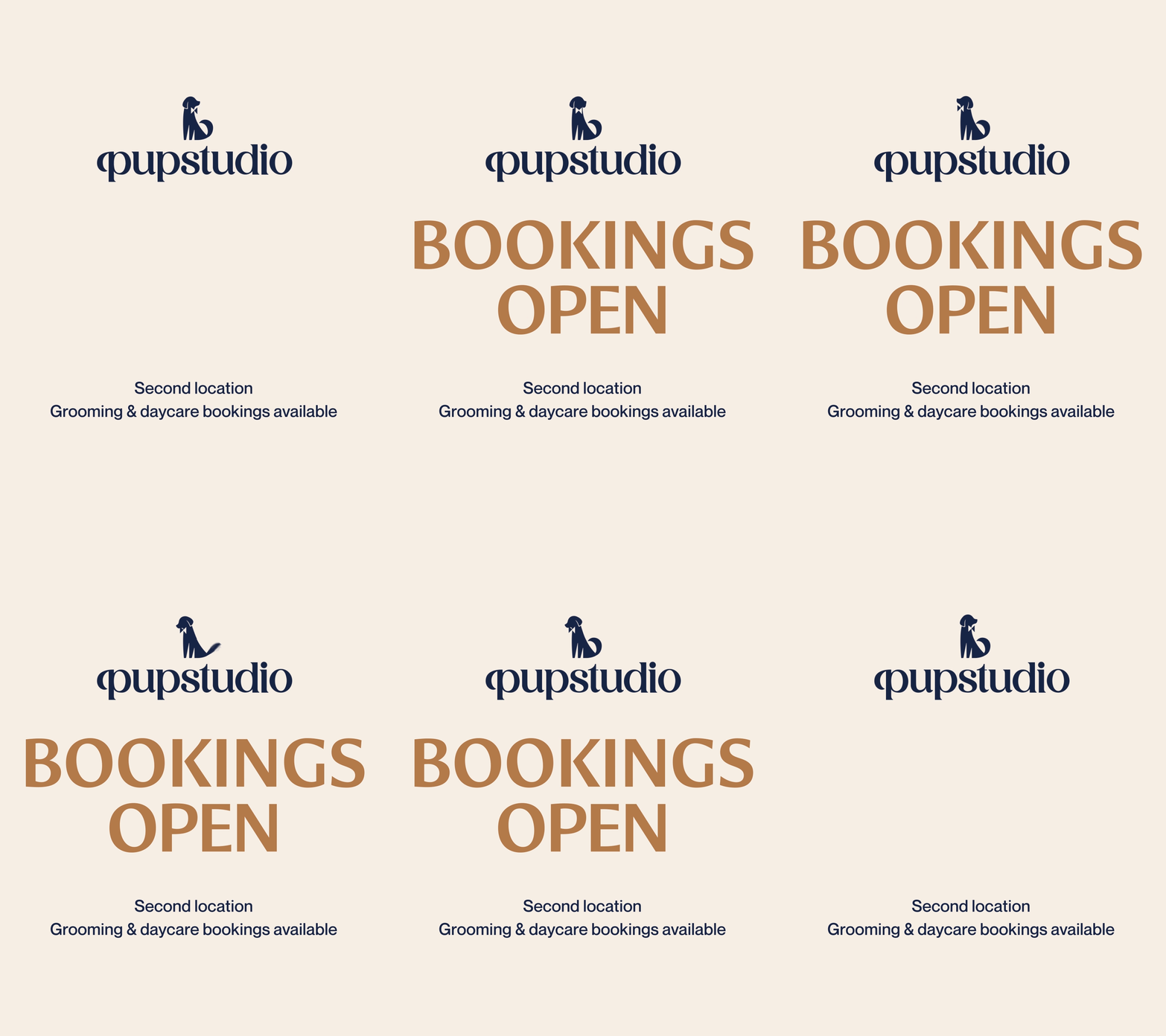
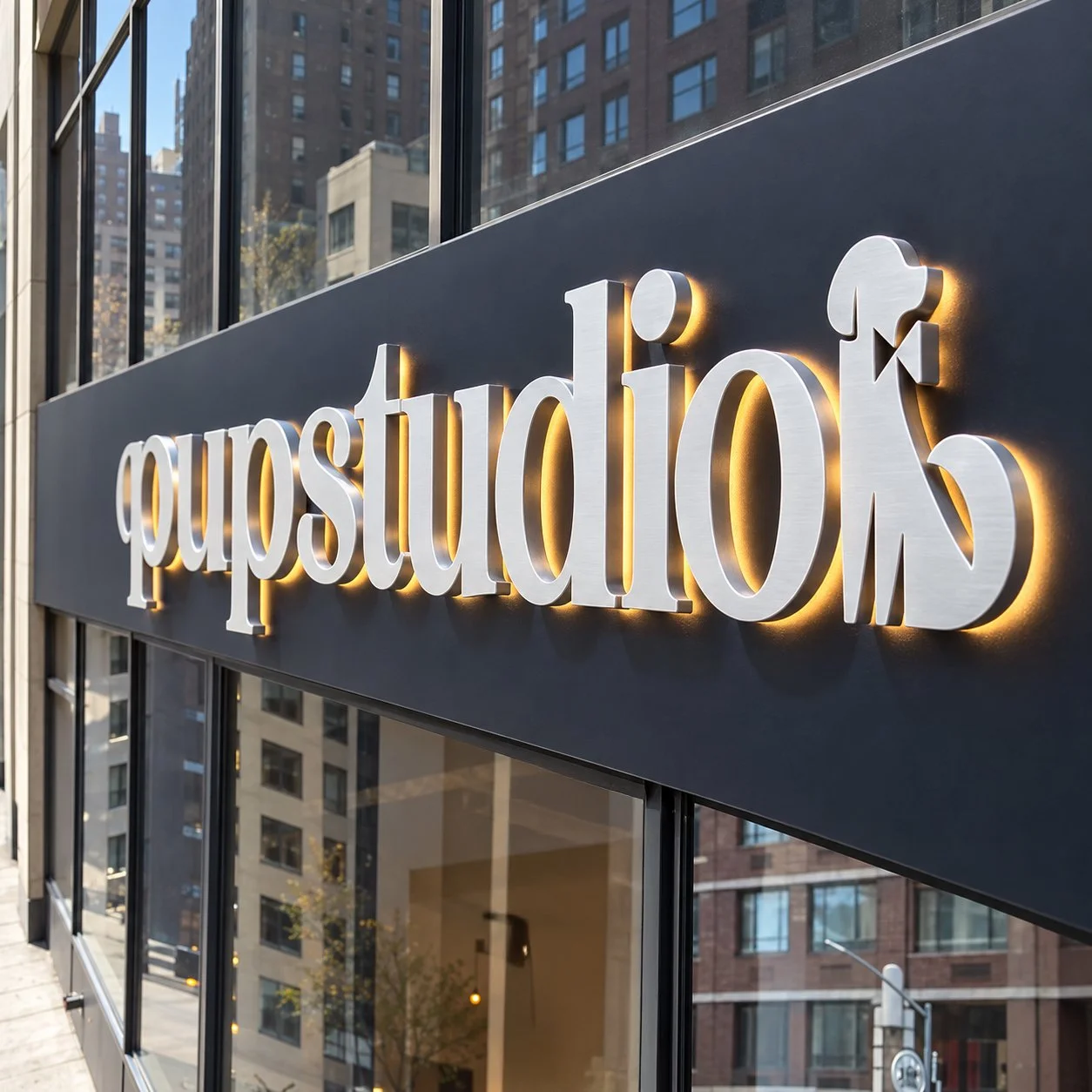
특히 반려견의 꼬리 곡선과 워드마크 속 ‘p’의 획이 시각적으로 이어지도록 설계해, 심볼과 워드마크가 하나의 조형 언어를 공유하도록 했습니다. 이를 통해 PUPSTUDIO가 지향하는 ‘친근한 프리미엄’을 시각화하고, 세심한 돌봄과 세련된 감각을 함께 전달하는 브랜드 정체성을 완성했습니다.
A familiar companion, thoughtfully refined
We created a new identity for PuPstudio by pairing a dog symbol wearing a bow tie with an elegant serif wordmark. The familiar canine form and smart bow tie bring warmth and refinement together, while the lowercase lettering and deep navy palette balance softness with quiet sophistication.
The curve of the dog’s tail visually echoes the stroke of the ‘p’ in the wordmark, giving the symbol and lettering a shared visual language. Together, these elements express PUPSTUDIO’s vision of an approachable premium brand, bringing thoughtful care and a refined aesthetic into one cohesive identity.