BATINO
Brand Identity Design
Creative Direction
Dongho Kim
Brand Design
Hyemin Choi
Geunjung Lee
Release date:
April 2023
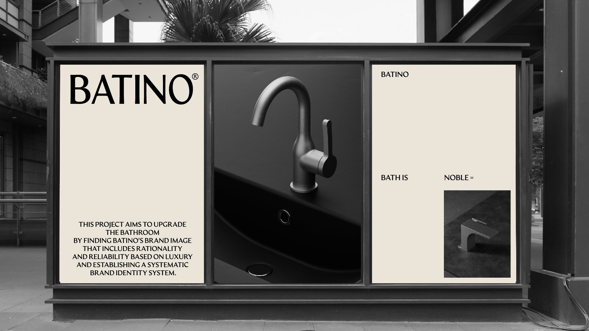
BATINO
Bath is Noble
BATINO(바티노)’는 기존 ‘Bath’ 와 ‘Innovation’을 합성하여 제작한 수전금구 브랜드 네이밍이었지만
‘욕실은 고결하다’라는 의미의 ‘Bath is Noble’라는 말로 그 의미를 재창조하였습니다.
‘BATINO’라는 키워드가 모두 포함되는 동시에 욕실이라는 공간이 단순히 씻기 위한 공간을 넘어 어떤 고귀한 가치를
실현시켜준다는 아이덴티티를 고급스럽게 담아서 표현한 특별한 슬로건이자 네이밍입니다.
Brand Story
우리는 어떠한 사람을 보고 인상을 떠올렸을 때 어떤 말, 어떤 행동을 하고 혹은 어떤 옷을 입었는지 무의식적으로 평가하며 파악하고는 합니다. 욕실도 다르지 않습니다. 기존과는 다른 품질, 다른 품격으로 다가간다면 에둘러 설명하지 않아도 그 가치를 누구나 알아볼 수 있을 것입니다. 바티노는 강요하지 않고 스스로 느낄 수 있는 사람과 사람 사이의 인상처럼 우리의 품격을 증명할 수 있는 프리미엄한 가치를 실현합니다.
When we encounter someone, whether consciously or unconsciously, we evaluate and perceive them based on their words, actions, and even the clothes they wear. The bathroom is no exception. If we approach with a different quality and dignity than before, without needing to explain, everyone will recognize that value. Batino embodies a premium value that can be felt by individuals, just like the impression between people, without imposing it upon them.


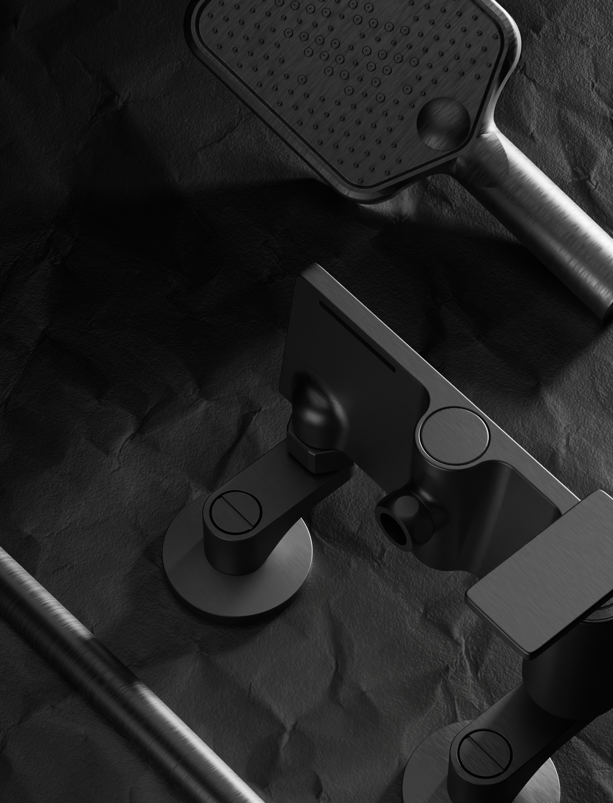
Brand Logo
직선과 곡선이 결합한 형태인 바티노 수전의 쉐잎에서 모티브로 얻어 다양한 굴곡과 유기적인 곡선으로 이루어진 워드마크 디자인입니다. 산세리프를 조성하고 있으나 세리프의 디테일한 곡선이 들어간 자소는 모던함과 우아함을 지향하는 프리미엄 수전브랜드 바티노의 아이덴티티를 형성합니다.
The motif for the Batino Sujun's shape, which combines straight lines and curves, inspires the wordmark design composed of various bends and organic curves. It features a sans-serif style with serif details that incorporate subtle curved elements, reflecting the modernity and elegance of Batino, a premium Sujun brand. This forms the identity of Batino.


Brand Slogan
“고결함은 욕실로부터 나온다” 라는 메시지로 고객의 고귀한 가치를 위해 품격있는 욕실을 만들겠다는 바티노만의 철학을 담고 있습니다.
The message "Nobility comes from the bath" embodies our philosophy of crafting sophisticated bathrooms to serve the refined values of our customers.

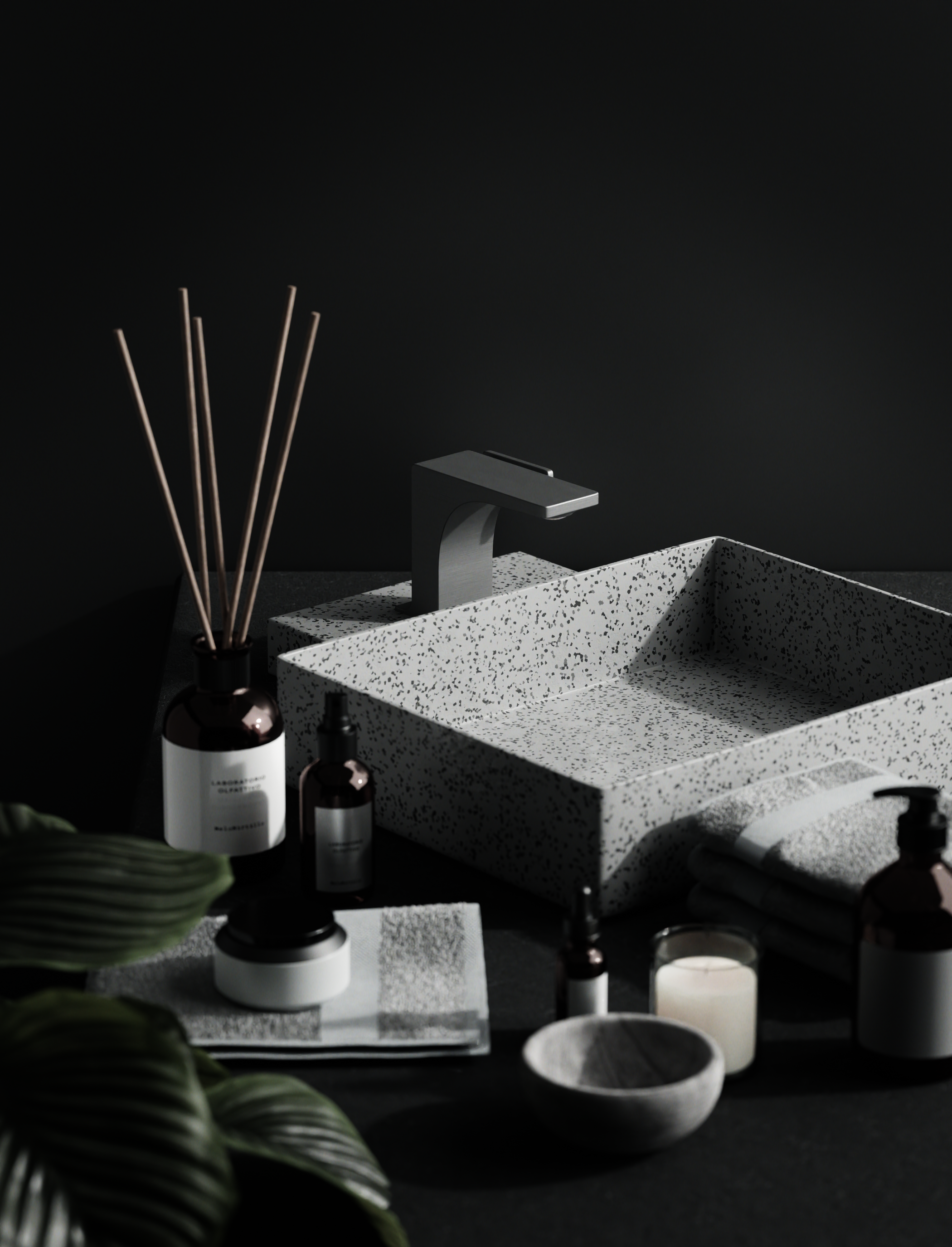
Brand Colour
바티노의 컬러는 자연이 주는 소중한 가치와 편안함 그리고 도시가 주는 현대적인 활력에서 영감을 얻어 탄생되었습니다. 이 컬러 조합은 자연의 아름다움과 조화로움을 상징하는 색감과 동시에 도시의 현대적인 에너지와 생동감을 담고 있습니다. 바티노는 이러한 컬러들을 사용하여 자연과 도시의 조화로운 융합을 표현하며, 고급스러우면서도 편안한 브랜드 이미지를 구축합니다
The colors of Batino are inspired by the precious values and comfort derived from nature, as well as the modern energy provided by the urban environment. This color combination ymbolizes the beauty and harmony of nature, along with the contemporary vitality and liveliness of the city. Batino utilizes these colors to express a harmonious fusion of nature and the urban landscape, creating a brand image that is both sophisticated and modern, yet comfortable.

Brand Typeface
바티노의 폰트는 조형적인 룩과 강력한 가독성을 갖춘 컨셉으로 구성 되었습니다. 영문폰트로는 "Artifex Hand CF"가 사용되었으며, 한글폰트로는 "Pretendard"가 선택되었습니다. 이 폰트 조합은 바티노의 브랜드 메시지를 강조하고, 현대적이면서도 안정적인 이미지를 전달합니다. 폰트 선택은 바티노의 창의성과 독특성을 시각적으로 강조하는 역할을 합니다.
The fonts of Batino are designed with a concept that combines a visually appealing look and strong readability. The English font used is "Artifex Hand CF," while the Korean font chosen is "Pretendard." This combination of fonts emphasizes Batino's brand message and conveys a modern yet stable image. The font selection plays a role in visually highlighting Batino's creativity and uniqueness.