E Life / E편한세상
Brand Identity Video
Motion Design
Dongho Kim
Client
DL E&C
Awards
- A winner, Brand Identity Design, Reddot Design Award 2021 in Germany
Release date:
June 2021

Brand Identity Video

Overview
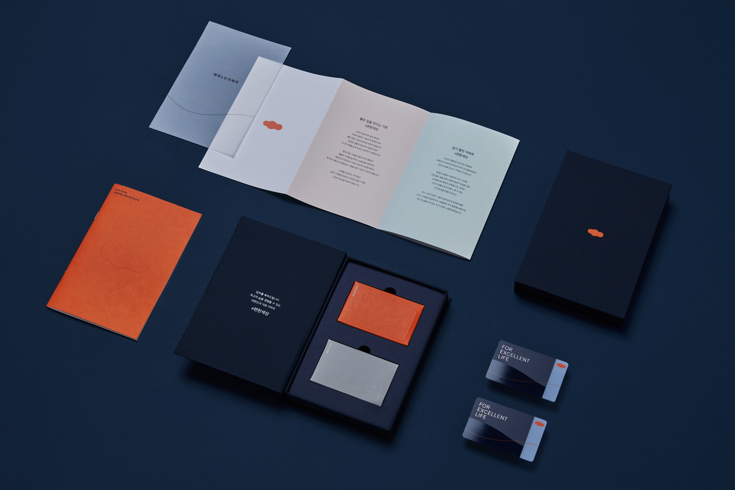
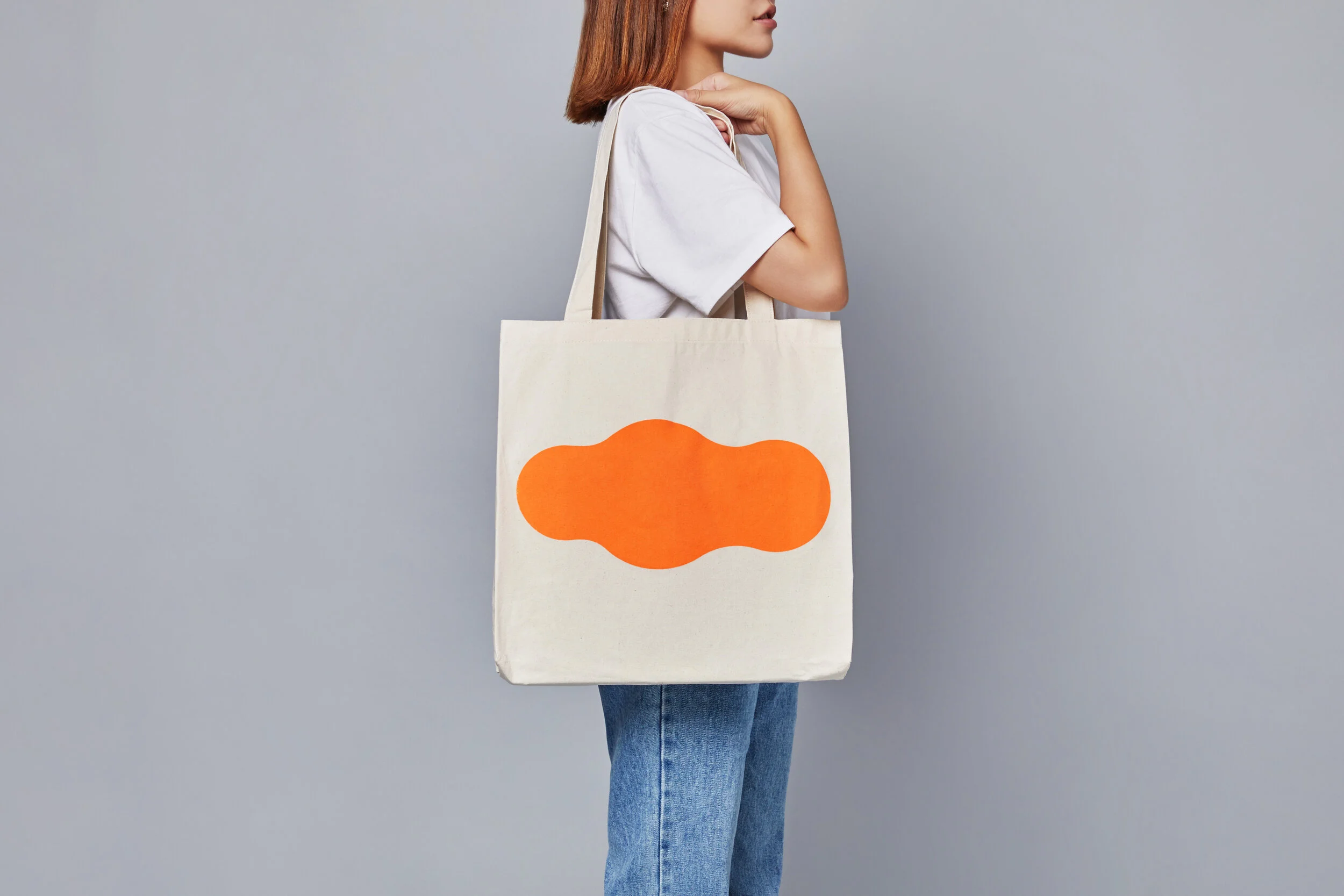
E Life is Korea's No.1 apartment brand and renewed its symbol to mark the brand’s 20th anniversary. The goal was to create a representative symbol that can extend brand direction from apartment brand to lifestyle brand. Our symbol has evolved several times, but this renewal focused on improving its informativeness of cloud-based the circle which presents satisfaction, pride and the desire to live at our brand. Just as the shape of the cloud changes over time, our symbol can be applied to various customer touchpoints through flexible graphic systems, and become a powerful visual device to provide an excellent life.
Motion Design
We have evolved the orange color and the shape of the cloud as our powerful heritage and brand asset. Our symbol has developed several times in response to the times. Since our symbol exposure became more frequently online than offline nowadays, showing consistent brand identity on various online and offline touch points became much more important. So we optimized our symbol for both environments. The cloud was refined to look more like a cloud, and a more symbolic visual system was established by removing detailed gradation and shadow so that only essences such as color and shape could be clearly seen in diverse environments.


